10 Proven Techniques to Improve E-commerce ROAS
About the Author: Digipeak is a 360° Digital Marketing Agency launched in 2020. Our mission …
23/10/2023 -
6 dk okuma
Stay up to date with Peakers
A landing page is a standalone web page designed with a specific purpose, often related to marketing or advertising campaigns. Its main objective is to capture the attention of visitors and encourage them to take a particular action, such as signing up for a newsletter, downloading an ebook, registering for a webinar, or making a purchase. Unlike other pages on a website, a landing page is focused on a single call-to-action (CTA) and is designed to guide visitors toward that action without any distractions or navigation options.
The design and content of a landing page are carefully crafted to align with the campaign’s goals and target audience. A compelling headline and engaging visuals quickly convey the value proposition of the offer or product. The content is focused, on highlighting the benefits of the offer and addressing any potential objections. A well-designed CTA button stands out prominently, prompting visitors to take the desired action. Additionally, landing pages often incorporate trust-building elements, such as customer testimonials, reviews, or security badges, to instill confidence in the offer and increase conversion rates.
Marketers use landing pages to measure the success of their campaigns effectively. By tracking the number of visitors who complete the desired action, known as conversions, they can assess the campaign’s performance and make data-driven decisions to optimize future efforts. Through A/B testing, marketers can experiment with different elements of the landing page to identify what resonates best with their audience and ultimately drive better results. In summary, landing pages are essential tools in the marketing arsenal, providing a focused and persuasive platform to convert visitors into leads or customers.
[cta-ekle slogan-metni=”Elevate your campaigns with our custom landing pages. Make every click count!” buton-metni=”Contact Now!”]
The landing page serves as a crucial gateway between a visitor and a specific marketing or promotional campaign’s intended goal. Its primary function is to capture the attention of the visitor and guide them towards taking a desired action, such as making a purchase, signing up for a service, or providing contact information. By presenting a clear and compelling value proposition, the landing page aims to persuade the visitor that the offer is worth their time and engagement.
To achieve this, landing pages are designed to be focused and distraction-free. They remove any navigation options or links that might lead the visitor away from the intended action, ensuring that their attention remains solely on the offer at hand. The landing page’s content is carefully crafted to be concise, persuasive, and relevant to the campaign’s objective, utilizing persuasive copy, engaging visuals, and a prominent call-to-action (CTA) button. By driving visitors to take a specific action, the landing page plays a pivotal role in converting potential leads into valuable customers and measuring the success of marketing efforts. It provides marketers with valuable data on the campaign’s performance, enabling them to optimize future strategies and maximize their return on investment.
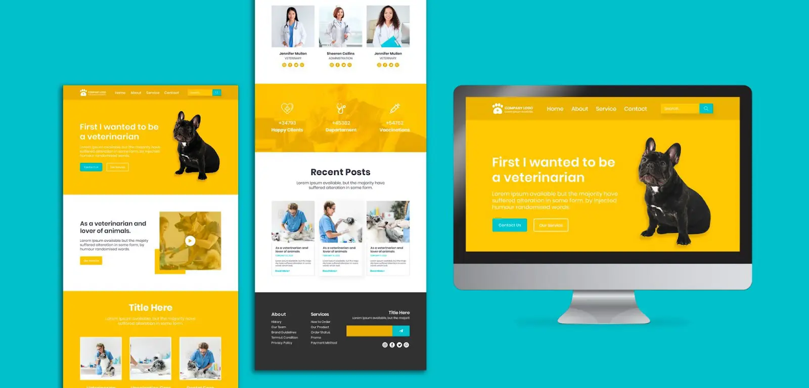
You may need a landing page in various situations, depending on your specific marketing or promotional objectives. Here are some scenarios when having a landing page can be beneficial:
[cta-ekle slogan-metni=”Boost ad success with Digipeak’s custom landing pages. Maximize conversions and ROI. Contact us to elevate your ads!” buton-metni=”Say Hey!”]
A good landing page design is essential for converting visitors into leads or customers. It should be visually appealing, user-friendly, and optimized for specific goals. Here are some key elements that make a good landing page design:
Remember that the goal of a landing page is to encourage a specific action, whether it’s signing up for a newsletter, making a purchase, or filling out a form. By implementing these design principles, you can create a landing page that effectively communicates your message, engages visitors, and maximizes conversions.
[cta-ekle slogan-metni=”Unlock success with Digipeak’s dynamic teamwork. Collaborate, innovate, and achieve together with our skilled professionals.” buton-metni=”Contact us now!”]
Get an Offer


Join Us So You Don't
Miss Out on Digital Marketing News!
Join the Digipeak Newsletter.
Related Posts

About the Author: Digipeak is a 360° Digital Marketing Agency launched in 2020. Our mission …
Most companies that invest in LinkedIn Ads don't get the results they expected, not because …
The digital retail environment is no longer defined by simple keywords and blue links. It …
Business-to-business (B2B) marketing is fundamentally different from consumer marketing. Long sales cycles, multi-layered decision-making mechanisms, …