
3 Advanced JavaScript Bookmarklets for SEO and Productivity
Bookmarklets are like mini-programs you run from your browser’s bookmarks bar to perform tasks instantly. …
17/05/2024 -
11 dk okuma
Stay up to date with Peakers
If you are selling online, a website is a virtual product. In this case, all of the descriptions of your goods and services are aimed at your audience. Studies have found that a visitor would decide to leave a web-based store within about 50 milliseconds of hitting the site. The consistency of this will be quite helpful in attracting new customers and turning them into loyal ones.
So, a crucial chunk of making a good first impression must be choosing a good design for your e-commerce website. Do remember that if you like to have a stylish and beautifully designed e-commerce website, you may have it by contacting Digipeak immediately!
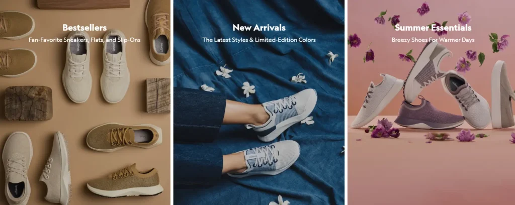
Allbirds is a footwear and apparel shop that very well represents values like simplicity, sustainability, and environmentalism through elements such as headlines and texts and also using ‘warm-toned’ photos. A website design is distinguishable through the text, powerful headlines, and product images among other things. Allbirds presents product details that cover everything from why the features are important to what materials have been used.
Additionally, there are close-up photos and videos on the website for customers to have a clearer look at each item. On top of this, it includes user reviews under product descriptions. This is a great method to increase customer confidence and help the clients finalize their purchases.
Is Your Website User Friendly?
Get a Free Design Analysis Now!
Is your website design outdated ? Doe it negatively affect UX and conversion rates? Prevent potential revenue loss and get your free web design analysis now!
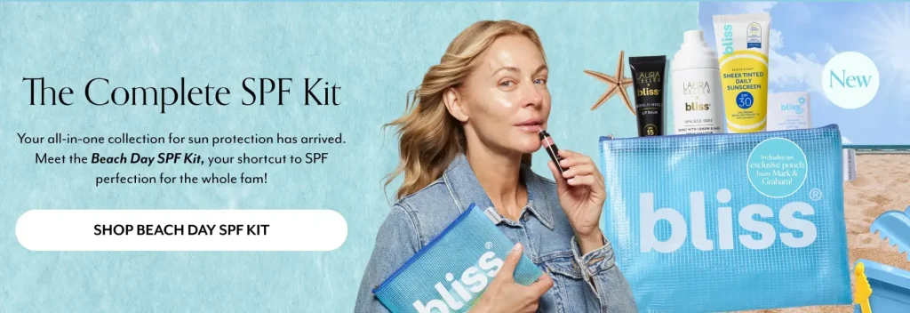
Bliss has a simple mega menu with all links. Having a fast review button on the product category page makes it easier for shoppers to get more product information without moving to some other page. One of the things that make this e-commerce site design fabulous are the lightness and freedom while using the site. Bliss has celebrated its fun nature on its website design. Also, good work has been done on photography.
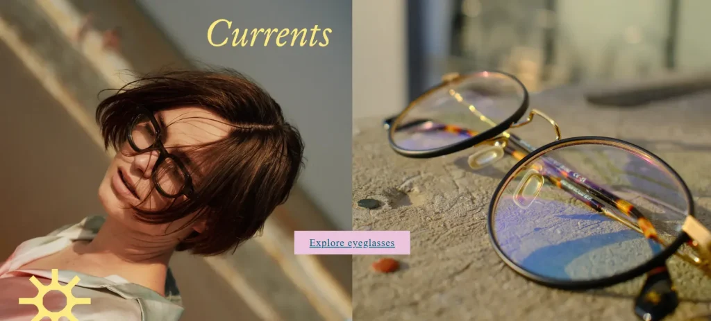
Dick Moby provides sustainable sunglasses and eyewear with the main goal of being environmentally conscious without sacrificing style. This e-commerce has added a little bit more fun into the process of the design to make the websites look more interesting. The product is highlighted by the quality of the photos used on the site and the simple background of the glasses.
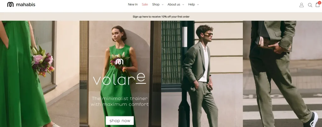
The Mahabis e-commerce site is easy to use and it has an interactive design. It can be a great inspiration of a slide show of pictures to present your products. As you reach the bottom of the homepage, you encounter an overview of how the shoes are made by Mahabis which is entertaining and ensures the users spend time on the page. The abundant white space contributes immensely to clean design and easy usability of the e-commerce site.
Google’s Language Inclusion website blends traditional layout with outstanding backgrounds from places all over the globe. The look and feel of the website embodies the main message: There are over 7,000 languages spoken in the world, but only a few are well-represented online. Google Research is trying to change that, one community at a time.

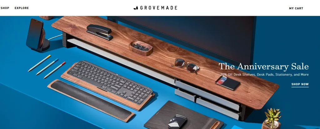
Grovemade is a brand that produces high end office supplies such as monitor stands, desk organizers and some unique workspace accessories that are made from natural materials. Their products highlight a modern look and their website reflects a modern and crafty theme by focusing on craftsmanship and the beauty of natural wood. The website design is minimalist but inviting and highlights the products using excellent photos. Another thing that impresses us about this e-commerce web design is that white space has been spread all through the page.
The Grovemade website space is designed to make it easy to browse the products, keeping the user from being overloaded with information. Moreover, the core value of this website is highlighted in the about page section which takes the style to a new level. When you hover over team members, you will see a funny picture of that team member. This brings more interactive and pleasant experience to the visitors, resulting in a fun design.
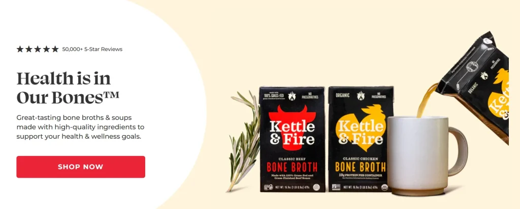
The layout of the top part of the Kettle & Fire site is similar to other ecommerce sites. But when you go down the page and click on buttons, the appearance of the site starts to change. The main ingredients of the company’s products are vegetables, and the site has photos of them everywhere. The fun slogans and color scheme are the features of the brand that are showcased through website design.
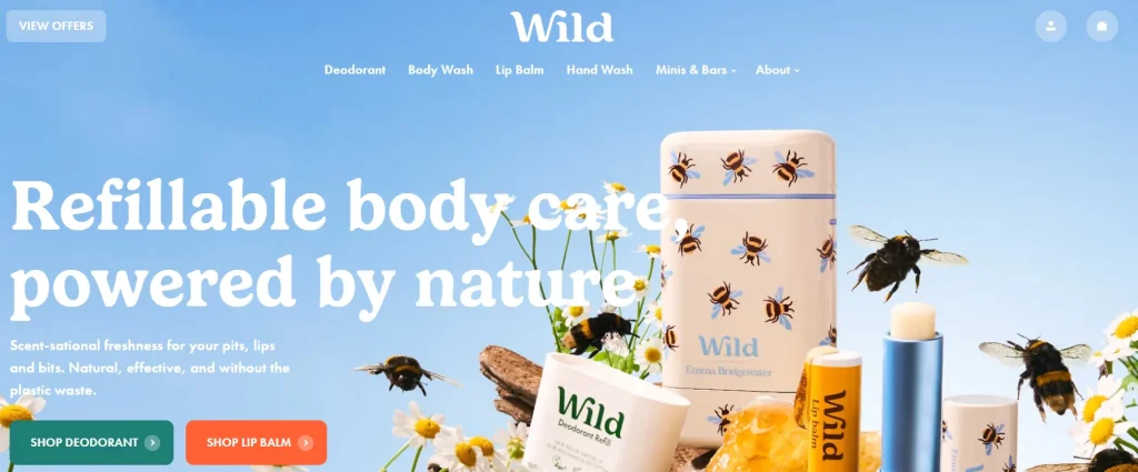
Wild is an online store that sells zero-waste personal care products. In comparison to many other websites, it does have more catchy animated header structure. The title is entirely transparent and disappears when you scroll down, it reappears the second you scroll back up. The packaging and background colors of this website are very harmonious. Among the noticeable features is the description of how you can use the products via the video with text that show a good design.
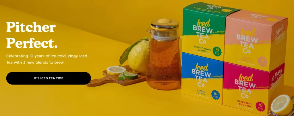
Brew Tea Co is a modern webpage which has a stylish color scheme that is clear just by loading the page. The given e-commerce website has a top-bar notification and an expandable menu with interlinks and images. Furthermore, the footer has quick links, social media icons, newsletter subscription widget, and contact info. The animated explanation of the tea brewing process is one of the website design features that is used to increase the user experience.
This website communicates a good feeling by using dark themes and space. It begins with a big banner of revolving videos and GIFs, which lead individually to the site, and allow the users to get what they like without searching for it. The frame layout is the detail which distinguishes the website from the others. Another feature is scrolling text for various categories, which brings interactivity to the simple website as a whole.
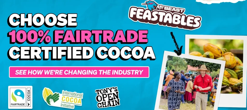
Feastables, with its lively and vibrant design, is one of the coolest examples of e-commerce website that you should visit. It consists of animated icons, attention-grabbing images, stylish highlighted descriptions, and a picture slider with images of customers enjoying our products. This calls for a certain degree of bravery as it produces a website that remains in people’s minds for long.
This awesome online store is characterized with a layout that has much white space helping in the presentation of the products better. The site itself with its very clean and organized design possesses a highly professional and sophisticated appearance. Products are listed sequentially, and when a customer hits them, there is some text provided in more detail about the product.
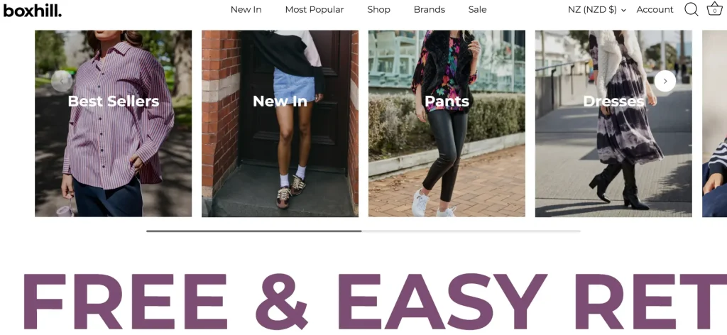
As soon as you land on Bouguessa’s website, you’ll be welcomed by a refined ambiance. This e-commerce site is an online fashion apparel retailer. Even though the site navigation has been simplified, pictures are placed on the foreground for selling the products. The black and white design helps the long dresses and colors that are bright stand out among other elements. Moreover, a smartly placed above the footer area is Instagram feed, so that visitors can easily imagine the product on real people.

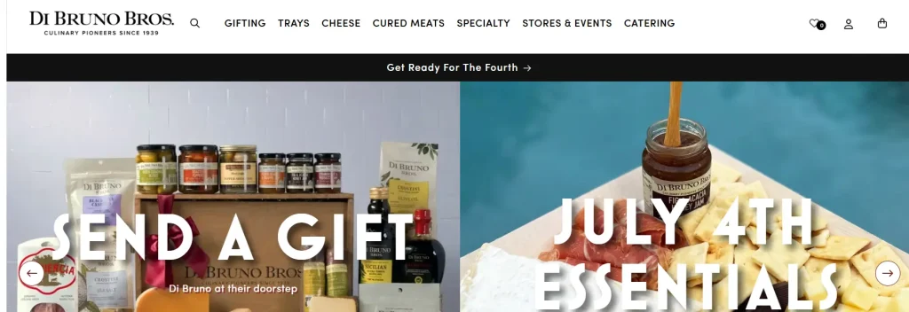
When you visit the website of Di Bruno Bros, the very first thing you are going to spot is its site design. One of the main features of this site is the customer ability to read a product’s brief description as he or she is browsing for products from the category page. The neatness of product images and layout of pages are the features that most users praise the website design has.
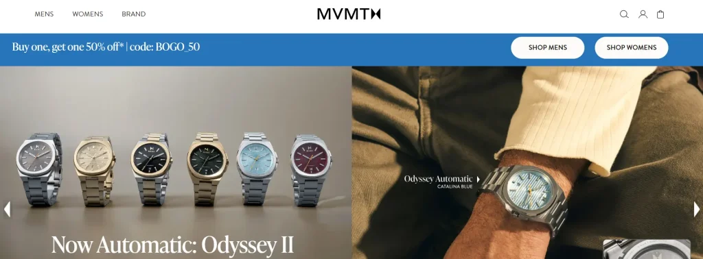
While browsing e-commerce stores, it is necessary to have a homepage that captures customers’ attention with product/service displays that are simply and appealingly. MVMT is fulfilling the very purpose of good website development through its design and style. Single-showcase arrangements of men and women watches are exhibited in visitor friendly design which have a simple feel while maintaining consistency to the watch options.
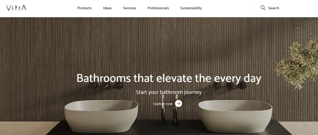
Vitra is notably e-commerce and specialized in selling superior designer furniture and household things. The site layout is minimalist and extremely creative, evoking a mood that is like a super cool design studio joined up with a modern art gallery. The menu is structured properly, which is very convenient for the customers to navigate products they like.
Mejuri is an online platform where all the product images are shown on white background in order to pop out especially the jewelry. This site has a distinct mobile layout. In the part where one is scrolled down, it displays the design of the physical store locations.

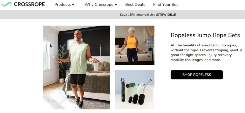
The purpose of the Crossrope online shop is to inform customers about the entertaining nature of fitness. They are not in the business of just selling jump ropes, they want to introduce their target audience to an exciting experience that will help them reach their fitness targets. So, video on the homepage design is very appropriate. They do not only find videos more engaging, but this feature also allows users to see real-life demonstrations of any product, generating a fascinating website design.
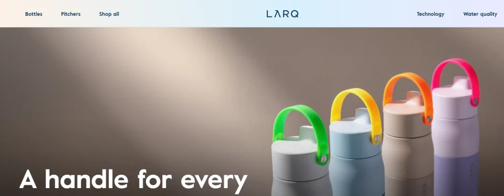
LARQ is an online shop selling high-tech self-cleaning water bottles and purification systems. The web design of LARQ brings together a clear and contemporary look with handy features. It is not only a webstore but also an intimate introduction to our new and exciting hydration solutions advertised on a stylish and captivating website. This website is simple and easy-to-navigate one which presents the products in a great way.
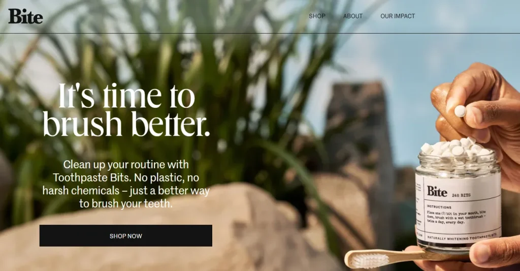
Bite is an e-commerce website that sells ecological toothpaste tablets in plastic-free, sustainable packaging, and aims to reduce plastic waste by selling them. The website has a clean and modern look that focuses on sustainability and natural ingredients.
Its layout is designed to educate consumers on the products’ benefits and environmental impact. In the process of designing, the interactive elements such as product comparison sliders are organized with a vivid animation for visitors’ motivation and the attraction of their attention.
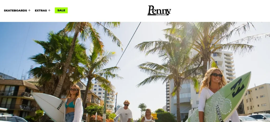
Penny Skateboards is a web store that carries skateboards. At the site entry, you are welcomed by the stunning lifestyle shots with the slogan which also greets you. The size guide on the homepage offers customers a detailed explanation of different options. The organization of the goods, color arrangement and concise presentation are some of the features that lead to the successful design of the site.
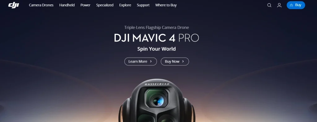
DJI is an online platform that sells high-end drones and camera tools for aerial photography, video shooting, and content creation. The website design displays a wide range of cutting-edge drone and camera technology, highlighting advances in aerial photography and videography. The website which enables easy navigation and categorization by products has a high-tech, interactive layout, thus it is engaging and informative for consumers.
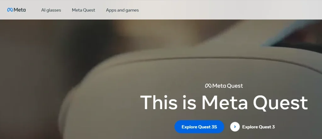
Meta Quest is an online shop which is mainly concerned with VR (virtual reality) headsets and accessories, and provides the VR experience within. Design of Meta Quest definitely serves as the peak of technological expression in present days. The website has a sleek design and is enhanced by visuals. It thus instantaneously transports visitors into the sphere of virtual reality and user-friendly navigation with clear layout allows them to effortlessly rummage all VR products and resources.
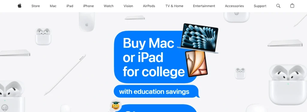
Apple is an e-commerce website that presents crisp and modern design. A classic feel of black and light gray colors are highly preferred in website design. Navigation is simple and to the point. Apple, the company, will often use a lot of blank space on its products, this is what makes the website feel neat and tidy.
To summarize, Apple’s minimalistic design system helps users to browse through products and spot the ones that interest them the most. The contemporary design displays the artsy appeal that keeps the users attentive and navigates them through the page.
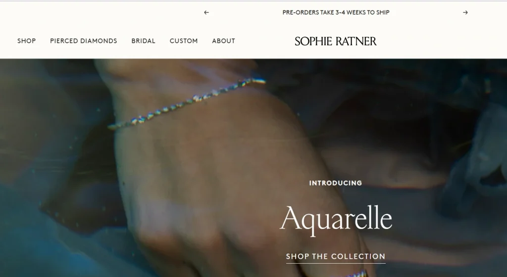
Sophie Ratner is a web store that sells individual made jewelry. The website has a minimalist look with large images which will lead to a valuable browsing experience. Apart from that, larger font size and more empty space improves the visual attractiveness of the page. Once users came onto the website, the slide-banner immediately caught their attention.
At Digipeak, we focus on the development of gorgeous and user-friendly websites with state-of-the-art design and development, rendering dynamic online assets tailor-made for our clients and their brand identities. Moreover, we offer robust e-commerce solutions to shop owners to enhance their business and make secure online sales with a reliable payment system and efficient sales approaches. We give priority to building mobile-friendly websites since these are very important for e-commerce businesses.
By being transparent and collaborative, our web development procedure is as follows: needs analysis and planning, proceed left to design, development, testing, and revision stages. In addition to design and construction, we are also available for deployment and support activities of our clients, whereby website maintenance and updates are carried out.
Feel free to contact Digipeak if you want your e-commerce website to be a stunning performance.
Get an Offer


Join Us So You Don't
Miss Out on Digital Marketing News!
Join the Digipeak Newsletter.
Related Posts

Bookmarklets are like mini-programs you run from your browser’s bookmarks bar to perform tasks instantly. …

The loading speed of websites is one of the essential factors to improve the user …
Chrome is used by the vast majority of people, and it makes sense to think …
There may be certain situations where the person who will design the website needs to …