
Mobile App UX Design: Best Practices for Modern Apps
Mobile app UX (User Experience) design focuses on creating intuitive, user-centered interfaces and interactions for …
10/01/2024 -
5 dk okuma
Stay up to date with Peakers
First encounters are very important. No matter how successful your services and technical infrastructure are, your potential customers will first meet your logo design. True, the book is not judged by its cover; but an unsuccessful logo design can affect the way your customers view you.
Logo design can sometimes tell a lot about a brand, especially what it does and what it represents. When consumers are impressed by the logo design, they are generally more inclined to invest their time and money in this company or product. That’s why a well-defined, catchy and professional logo design is essential.
At this point, there are numerous factors to consider.
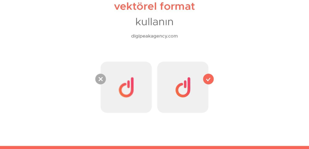
Vector-based images are easier to use than pixel-based (raster) images. In order to avoid any image loss in different usage patterns and various scaling, use vector-based design programs. For example, if you need to zoom in on your logo, your image will start to become pixelated in pixel-based designs.
Because lines and shapes in vector files are made up of mathematical calculations, your image looks crisp and vibrant in any situation. For this reason, vector-based software is generally preferred for print files.
Example vector-based file extensions: ai, .eps, .pdf, .svg
Example pixel-based file extensions: .jpg, .gif, .png, .tif
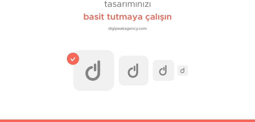
A simple logo design is more appealing for the visitors. People are more likely to trust something they are familiar with, so they should be able to easily remember your logo. an intricately designed
The logo may look impressive at first, but after a while you will need to change it.
Working extensively is a good thing, but not in logo design. Your logo should be scalable to any size. If your design contains too many details, a complex image may emerge in small-sized uses.
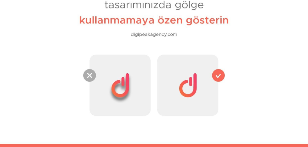
Shading may look good in digital uses, but it negatively affects your design quality in print. Therefore, be careful not to add external effects such as shading to the main use of your design. Such effects will both increase the file size and cause you to get a more complex image.
Especially if you have a project that requires shadows, you can use these effects in various design programs. They are easily added from the outside. But in general, such effects are not recommended in logo designs.
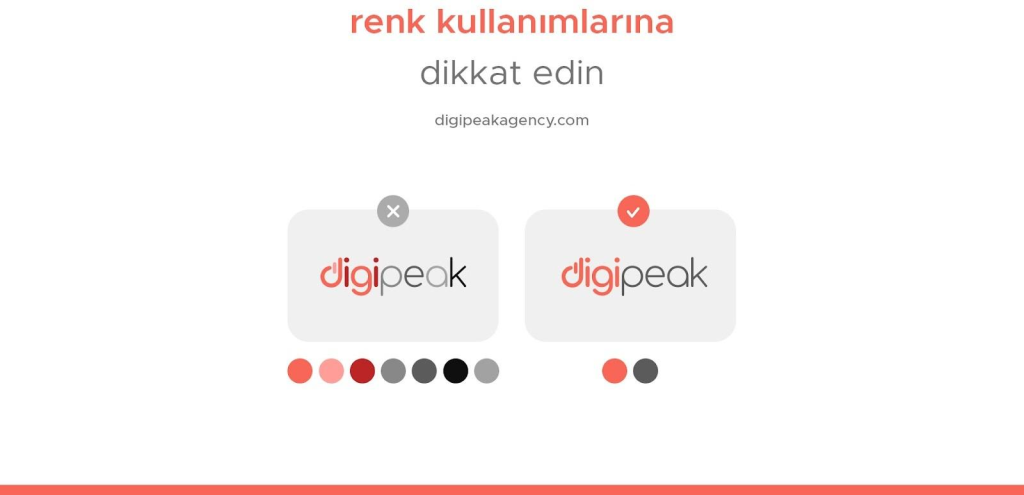
When you create a color palette for your design, it’s important to explore what emotional meaning each color has. Take care to obtain information from various sources about the main colors you are targeting and their associations.
The colors you choose should convey the value of your brand and be industry-dependent. For example, if you want to promote an eco-friendly brand, you can choose the natural colors green, blue, brown or yellow.
After choosing your primary color palette, you need to make sure you know the difference between preferred hues for web and print. If you do not make common ideal color preferences for both uses, your digital designs may appear in different colors.
Incompatible color combinations and the use of too many colors can make your designs look complicated and amateurish.
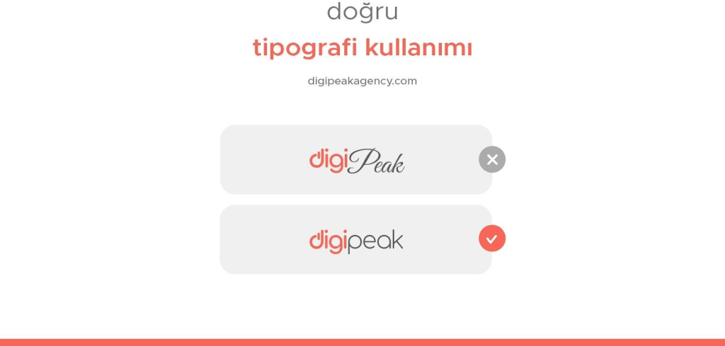
Choosing the right font is much more difficult than many beginner designers realize. Just like colors, the typography in your design should be based on your target audience. Each font has its own unique character and various interpretations. For example, official institutions generally prefer quotation fonts to emphasize seriousness.
Today, most brands use a variety of fonts from the Sans Serif family in order not to disturb the minimalist design structure.
Typography is so hard to decide, you have to spend time sorting and testing various fonts in your design.
The typography you choose should be successful in terms of design aesthetics and should not lose its readability in various dimensions.
Remember that using more than two fonts is not recommended.
There are many rules, but after a point, one should not be too limited to rules in design. You can be as stylish, luxurious, or traditional as you want if you believe the font you choose is appropriate for your brand.
Sectoral research, feedback, and revisions made throughout the design process can tire you out, but it will be worth it when you meet with the customer (this person can be yourself) on a common idea.
If you want to get support in this regard, the Digipeak family would be happy to provide professional design services for your brand. For more information, send an e-mail to us!
Get an Offer


Join Us So You Don't
Miss Out on Digital Marketing News!
Join the Digipeak Newsletter.
Related Posts

Mobile app UX (User Experience) design focuses on creating intuitive, user-centered interfaces and interactions for …

At Digipeak, we've helped countless businesses transform their digital presence through Pinterest advertising. Through our …

Although the term "graphic design" has only been in use since the 1920s, this art …

Font is a very important design element for SaaS (Software as a Service) businesses. It …