


Why Every Medical Practice Needs a Professional Website
a medical practice without a website is almost invisible. Patients increasingly start their health journey …

02/06/2025 -
27 dk okuma
Stay up to date with Peakers
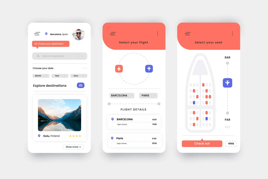
Mobile app UX (User Experience) design focuses on creating intuitive, user-centered interfaces and interactions for smartphone and tablet applications. Unlike desktop UX, mobile UX must account for smaller screens, touch input, and on-the-go usage. In today’s digital landscape, over 60% of global internet traffic comes from mobile devices, and app retention is notoriously low (the average app loses 77% of daily users within 3 days).
This makes mobile UX crucial: a great user experience can boost engagement and retention, while poor UX drives users away (90% stop using a badly performing app). In this guide, we’ll cover fundamental mobile UX design principles, modern trends, and actionable tips to improve performance, accessibility, navigation, and overall satisfaction.
Whether you’re a designer, product manager, or developer, these best practices and examples will help you build user-centric mobile apps that keep people coming back.
At the heart of mobile UX design is user-centered design: prioritizing real user needs, goals, and contexts throughout the process. This means conducting UX research, defining personas, and continuously testing designs with actual users. A user-centered approach leads to empathetic, intuitive apps. For example, Digipeak’s UI/UX design services emphasize early research and iterative testing to ensure designs meet real user expectations.
When sketching or wireframing a new app, start by mapping user flows and tasks. Keep interfaces focused on key user goals. Mobile app UX design is “the process of designing the user interface (UI) and overall experience for a mobile application,” with a focus on creating “seamless, intuitive” interactions for smartphone users. In practice, this means:
Interview or survey target users, conduct field studies, and analyze competitor apps to identify pain points.
Build low-fidelity wireframes and high-fidelity prototypes (in tools like Figma or Adobe XD) and gather feedback before coding.
Run mobile usability tests (e.g., with UserTesting or Maze) to catch friction early. Only 55% of companies conduct UX testing – you can stand out by testing more thoroughly.
Incorporate in-app feedback prompts or analytics (using tools like UXCam, Firebase Analytics) to learn how people actually use your app and where they struggle. Continuous improvement, driven by real user insights, leads to better retention.
Good mobile UX is about anticipating user needs and reducing friction. Every element – from content hierarchy to button placement – should serve the user’s primary task. As one guide states, mobile UX should be “snackable, focused and thumb-friendly”, prioritizing essential features and easy navigation. For example, place important actions (like “Buy Now” or “Save”) within thumb reach, use clear labels, and avoid overwhelming users with too many options.
Mobile and desktop UX share basic goals, but key differences demand unique design strategies. Mobile devices have smaller screens, rely on touch instead of mouse/keyboard, and are used in varied contexts (outdoors, one-handed, short sessions). By contrast, desktop screens are larger and often used in more stable environments (offices, homes). Some important distinctions:
Screen Size & Layout:
Desktop users have large monitors; mobile UI must fit on screens typically 5–7 inches wide. This requires minimalist layouts and prioritizing content. For instance, News apps often condense information, while desktop sites can show more at once.
Interaction Model:
Mobile relies on touch gestures. Icons and buttons must be large enough to tap comfortably. Apple’s Human Interface Guidelines recommend at least 44×44 points (pt) for tappable elements. Similarly, the BBC Accessibility guidelines recommend touch targets of 7–10 millimeters to accommodate average finger size. In practice, always ensure ample padding around taps and use recognizable icons to avoid input errors.
Context & Behavior:
Desktop tasks can be complex and lengthy; mobile usage is often quick and context-driven. A Google study found mobile sessions typically last under 2 minutes. Design accordingly: streamline key flows, save user progress, and optimize for short bursts of interaction. For example, a shopping app might save your cart so you can continue later, knowing mobile users may abandon complex forms if interrupted.
Performance Expectations:
Mobile users expect speed. Akamai research shows people expect mobile content to load in under 3 seconds, faster than desktop expectations. Slow apps get deleted; studies report 40% of users abandon a site (or app) if it takes more than 3 seconds to load. Focus on optimizing images, reducing requests, and using native components. Tools like Google’s Lighthouse or Mobile Vitals can help identify performance bottlenecks.
Navigation & Structure:
Desktop sites often use complex menus and multiple columns; mobile apps should use simple navigation patterns. Common mobile patterns include bottom navigation bars, swipe gestures, or hamburger menus. Ensure the most important destinations are accessible in 1-2 taps. For example, a common pattern is a bottom tab bar with 3–5 main tabs (Home, Search, Profile, etc.), making it easier for thumbs to reach.
In summary, mobile UX emphasizes brevity, clarity, and gesture-based interactions. It’s not just a shrunken desktop – it’s a different user experience. Always test designs on real devices under real conditions (low light, one-hand use, etc.). For example, using high-contrast colors for outdoor readability and minimizing input fields for quick interactions.
A great mobile app experience is built on solid UX principles. Here are core principles to follow (each supported by research or expert consensus):
Every screen should have a clear purpose. Avoid clutter and use minimalist design. Prioritize one main action per screen. Nielsen Norman Group’s usability heuristics (like visibility, affordance, feedback) apply here. Mobile interfaces benefit from large fonts, legible text, and concise copy. A study found mobile users prefer short, engaging content, with roughly 70% higher engagement for concise text.
Use familiar UI patterns and consistent styling. If your app lets users swipe in one section, don’t require a double-tap elsewhere – be predictable. Users expect standard mobile interactions (swiping up to scroll, back arrows, pull-to-refresh, etc.). Sticking with familiar patterns reduces learning curve and friction. A large red button always means “stop/danger,” while blue links are typically navigational. Keep color schemes and typography consistent across screens.
Design for fingers, not cursors. Ensure tappable elements are big enough (Apple: ≥44pt; Material Design: 48dp). Maintain adequate spacing between buttons to prevent mis-taps. Use gestures where appropriate (swipe to delete, pinch to zoom) but always provide visual cues. For example, an arrow or affordance should indicate swipe actions. Group related actions logically (Tip: link adjacent related elements into a single larger touch target).
Take Advantage of Automation with Artificial Intelligence!
How can you use your time more efficiently? Artificial intelligence saves you time by automating repetitive tasks. Learn how you can leverage AI to accelerate your business processes.
Design inclusively so all users can use your app. This means:
Use high contrast text/background (WCAG AA recommends at least 4.5:1 contrast for normal text). High-contrast colors help users read apps even in bright sunlight.
Support dynamic text resizing (for vision-impaired users, settings like iOS “Large Text”). Don’t lock font sizes; use relative units. Ensure text wraps or reflows.
Label all buttons and images with descriptive tags so VoiceOver/TalkBack users can navigate.
Provide voice control or keyboard navigation (e.g., for accessibility or hardware keyboards).
Never rely solely on color to convey information (e.g., use icons or labels).
Designing for accessibility not only helps people with disabilities; it also improves usability for everyone (e.g., users in noisy or bright environments). Digipeak’s accessibility guidelines recommend designing with an inclusive mindset to “maximize your audience reach and compliance” (see their mobile app development offerings).
Your Visuals Stand Out But You're Not Getting Any Feedback?
Get a Free Design Audit Now!
Let's evaluate together how you can better engage with your target audience visually, dysfunctional designs, and tips to increase engagement. Fill out the form now and get your free analysis report!
Always give immediate feedback to user actions. When a button is tapped, provide a visual or haptic response so users know it registered. Use loading indicators for network requests. If an action fails, show a clear error message (more on this below). Feedback reduces user anxiety and guides them in the flow. For example, if a form is submitted, show a checkmark or success screen, or if a button is disabled until form inputs are valid, gray it out and show a hint.
Fast, smooth apps feel polished and trustworthy. Optimize for quick load times and transitions. For example, lazy-load images so screens appear fast, and animate interactions at ~60fps. Studies show 40% of users abandon a page that takes more than 3 seconds to load. On mobile, even higher expectations apply. Use tools like Android Profiler or Xcode Instruments to reduce CPU/GPU load and memory usage. Limit unnecessary background services. Remember, a responsive UI that never freezes is crucial; even small delays make users lose trust.
Break tasks into small steps. Instead of one long sign-up form, use multi-step processes with progress indicators. Pre-fill or save data where possible (e.g., use autofill for address forms). Only ask for essential input – removing non-critical form fields like “favorite color” to avoid fatigue. Providing input defaults, using pickers for dates, and auto-completing addresses can greatly reduce typing on mobile keyboards.
These principles ensure the app feels intuitive and “just works.” For instance, best practices emphasize making navigation effortless (“the easier your app is to navigate, the more likely users will keep using it”) and balancing speed with functionality. Combining these principles leads to streamlined designs where users can complete tasks with minimal friction.
Navigation is a critical aspect of mobile UX. Good navigation lets users move through the app quickly and predictably. Consider the following navigation best practices:
Use Familiar Patterns: Common patterns include bottom navigation bars, slide-out menus (hamburger menus), or swipe gestures. For most apps, a bottom tab bar with 3–5 primary sections (e.g., Home, Search, Profile) is ideal; it’s easy for thumbs and always visible. For secondary sections, use a “More” tab or a slide-out menu. For instance, Instagram uses a bottom tab bar for primary sections like Home, Search, Reels, Shop, and Profile.
Progressive Disclosure: Hide advanced or less-used options under submenus or accordions. Don’t show everything at once. For example, settings or account details often go in a separate “Profile” or “More” section. This keeps the main interface clean.
Breadcrumbs and Back Navigation: Mobile apps should make it easy to go back. Use the native back gesture (Android back button, iOS back swipe) or an on-screen back arrow. In deep flows (like checkout), provide a clear way to see where the user is (e.g., “Step 2 of 4: Shipping”).
Readable Menus: Keep menu text concise. Use clear, scannable labels (e.g., “Settings” instead of “Application Preferences”). Icons can help, but always include text or tooltips for clarity.
Search and Shortcuts: If an app has many sections (like an e-commerce app), include a search function accessible from every screen. Also consider shortcuts: iOS Home Screen Quick Actions (long-press app icon) can jump to key features, and Android App Shortcuts do similarly. These small additions can greatly improve findability.
Consistent Entry Points: Key actions should be reachable from anywhere. For example, a “New Post” button in a social app might be a persistent “+” tab or a floating action button. This reduces dead-ends.
Improved navigation boosts retention: the more quickly a user finds what they need, the more likely they are to continue using the app. As UX experts note, sticking with tried-and-true patterns (while branding the experience) helps avoid user confusion.
Speed and performance are fundamental to UX. Users rapidly abandon apps that feel slow or buggy. According to research, 90% of users have stopped using an app due to poor performance. Follow these tips to keep your app fast and responsive:
Reduce initial load by lazy-loading content and prefetching data for anticipated screens. Compress images (using WebP/AVIF for Android, HEIF for iOS) and minify assets.
Whenever possible, use native UI components (buttons, lists) instead of custom webviews; they render faster and behave predictably. If using React Native/Flutter, preload bundles and optimize bridging.
Do heavy computations off the main thread. Cache server responses (e.g., using SQLite or local storage) so users can see content even when offline or on slow connections. Show cached data immediately and refresh in background.
Monitor memory to avoid crashes. Features like location updates and animations consume battery; use them judiciously. For example, disable GPS polling when app is in background, and use push notifications sparingly so as not to wake the device often.
Equally important are feedback and error-handling mechanisms to keep users informed and confident:
If fetching data, show spinners or skeleton screens so users know something is happening. For example, Facebook uses gray placeholders while loading a feed.
On long actions (file uploads, downloads), show progress bars or percentages. This reduces anxiety and prevents users from tapping “close” out of impatience.
Assume network errors or failures will happen. If a network request fails, don’t show a cryptic error; instead, display a user-friendly message (“Couldn’t connect – check your internet and tap Retry”). Provide retry buttons or fallback content. For example, many apps show “Pull to retry” on failed content loads.
When users perform destructive actions (delete, logout), offer an “undo” option via a temporary banner or toast. This feedback loop prevents mistakes and improves satisfaction.
Confirm only when necessary (e.g., “Are you sure you want to delete?”). Avoid overusing alerts – they interrupt flow. Use subtle modals or inline confirmations instead.
By providing clear, timely feedback and handling errors gracefully, you keep users in the loop and reduce frustration. These mechanisms make the app feel polished. “Nothing frustrates users like a slow app,” so balancing speed with feedback is key.
Modern apps must be designed for everyone. Accessibility features not only help users with disabilities, but also improve usability for all users. Some actionable accessibility tips:
Semantic UI Elements: Use system UI elements that support accessibility by default (e.g., Android’s Material components or iOS UIKit). These have built-in support for screen readers and dynamic type.
Large Touch Targets: Ensure tappable areas are at least 44×44 pts (≈9–10mm). This benefits users with motor challenges and reduces errors for everyone.
High Contrast & Color Blindness: Aim for high contrast ratios (text vs background ≥4.5:1). Avoid color combinations problematic for colorblind users (e.g., red/green). Provide alternative text for icons and avoid using color alone to indicate state. For example, if you color errors red, also use an “!” icon or text label.
Adjustable Text Size: Support the device’s text-size settings. On iOS, adopt Dynamic Type; on Android, use sp units. Check layouts at large text settings.
VoiceOver/TalkBack: Test your app with a screen reader to ensure the reading order is logical and labels are meaningful. For instance, ensure that unlabeled icons have content descriptions.
Hearing & Cognitive: Provide captions for audio, avoid auto-playing loud sounds, and design straightforward, consistent interfaces to reduce cognitive load.
Inclusive design often uncovers new innovation opportunities. For example, many social apps offer a “Dark Mode” not just for aesthetic preference, but also for users with light sensitivity. Allowing theme switching or high-contrast modes can significantly improve comfort and retention. Likewise, voice-controlled navigation (e.g., screen reader gestures or integration with Siri/Google Assistant) opens your app to users who can’t use touch temporarily. Including these features is now considered a best practice.
Figure: Prioritize readability and contrast. High-contrast text (right) vastly improves readability in daylight conditions, compared to low-contrast design (left). Such contrast is essential for an accessible experience.
Designers often confuse mobile and desktop experiences. However, mobile UX has unique considerations. On mobile, users rely on touch (not mouse), screens are smaller, and interactions must fit in short time windows. Desktop apps can afford complexity and large text. For example:
Understanding these differences ensures that a mobile app feels tailored, not like a squeezed desktop site. Always design with the mobile user’s context in mind – for example, accounting for one-handed use or on-the-fly attention spans.
Mobile UX is a fast-evolving field. Here are some current trends and best practices to consider:
Dark Mode and Themes: Offering dark mode not only conserves battery (on OLED screens) but also reduces eye strain in low light. Follow Material and Apple guidelines for dark theme color palettes. Let users switch modes manually or tie to system settings.
Microinteractions: Small animations (button ripples, swipe animations) give users intuitive feedback. For instance, a “like” button that animates on tap confirms action. However, keep them subtle and short to avoid slowing the app.
Personalization & AI: Use analytics to personalize content (e.g., recommended news or products). Implement AI assistants or chatbots within the app for quick help. Modern apps often use machine learning (ML) for features like smart replies or search suggestions. Remember to let users opt in and maintain privacy.
Augmented Reality (AR): In some apps (retail, gaming, navigation), AR features can enhance UX. For example, a furniture app might let users place items in their room via AR view, vastly improving purchase confidence. If AR fits your product, ensure it’s intuitive and doesn’t drain performance.
Voice Interfaces: Integrate voice search or commands where appropriate. Mobile UX trends show growing interest in hands-free interactions (e.g., dictation for search, voice navigation). Always pair voice UI with visual alternatives for flexibility.
Neumorphism & Aesthetic Styles: Design trends like neumorphism (soft shadows, 3D buttons) or brutalism (bold, flat layouts) may influence your app’s look. Choose a style that fits your brand and test for usability – for example, neumorphic buttons must still be clearly tappable.
Privacy-Centric UX: With privacy concerns rising, good UX now means being transparent. Show clear consent screens, explain data usage, and allow easy revocation of permissions. Apps that respect user privacy build trust (and often increase retention).
Stay updated by reading UX blogs (e.g., Nielsen Norman, Smashing Magazine) and by testing how users respond to new patterns. However, do not blindly follow every design trend – always validate with your user base.
Designers have a rich ecosystem of tools for mobile UX/UI. Here are some top choices with current context:
Figma: A cloud-based interface design and prototyping tool. Figma’s real-time collaboration is ideal for distributed teams. Its auto-layout and responsive design features help create adaptable mobile layouts. Example: Use Figma’s “Prototype” mode to link screens and simulate navigation. The Miro & Figma integration can also facilitate user journey mapping.
Adobe XD: A powerful design/prototyping tool. It offers features like Auto-Animate for microinteractions and voice prototyping. With XD’s repeat grid, designers can quickly build lists. Use XD’s integration with Creative Cloud Libraries for consistent assets.
Sketch: Popular on macOS, Sketch provides robust UI design features and a plugin ecosystem. It has Symbols for reusable components and supports prototyping (with external tools like InVision). Sketch is often paired with Abstract or Plant for version control in teams.
InVision and Marvel: These tools allow quick prototyping and user testing. Designers can upload screens and create interactive prototypes without coding. InVision’s Freehand and whiteboarding facilitate brainstorming app flows.
User Testing Tools: Platforms like UserTesting, UXCam, Hotjar, or Mixpanel help gather user behavior data. For example, UXCam records session replays on mobile apps (see above) and analytics; UserTesting lets you recruit users to try your app and record their feedback. Maze or Lookback.io can turn prototypes into tests.
Wireframing and Diagramming: Tools like Balsamiq or Miro are great for early wireframes and flowcharts. They help illustrate user flows and site maps before detailed design. Integrating these diagrams into project docs clarifies the planned UX.
Accessibility Checking Tools: A11y tools (like Stark plugin for contrast checking in Figma) help ensure WCAG compliance. Apple’s Accessibility Inspector and Android’s Accessibility Scanner can audit your mobile UI for issues.
Use these tools as enablers, but remember that the principles drive design – the tools just implement them. For example, creating a high-fidelity prototype in Figma is only valuable if you’ve already nailed down a user-centric flow. Integrating design handoff tools (Zeplin, Figma Inspect) ensures developers have the specs they need.
Example – Streamlining Onboarding: Many mobile apps fail when onboarding is painful. A best practice is progressive onboarding: show only essential signup steps, allow social logins (Google/Facebook), and highlight benefits with screenshots. For instance, Dropbox’s mobile onboarding asks only for name/email, with a progress bar at the top. Follow that pattern, and use a “Skip” option to let users dive in sooner.
Tip – Thumb Reach Mapping: When designing main menus, sketch where thumbs naturally fall on common phone sizes. Key actions should lie within the “comfortable zone” (the lower middle of the screen for right-handed users, for example). Tools like Figma’s measurement can ensure that buttons aren’t placed too high for one-handed use.
Example – Dark Mode: Implement system dark mode support. Many apps now automatically switch themes based on device settings. Test your color palette in both modes. For instance, a white background might become a dark gray; ensure secondary elements remain visible. Users appreciate the consistency with their device preferences.
Tip – Accessibility Check: After your design, simulate different needs: Enable iOS’s “Larger Text” in Simulator or Android’s “Display size” setting. Check that all screens are still usable. Use a color blindness simulator (like Stark plugin) to verify your palette. This step often uncovers issues you can fix before development.
Example – Offline Mode: If your app uses network data, add an offline fallback. Netflix and Spotify cache content so users can still use them offline. At minimum, detect network loss and show an informative screen with a “Retry” button. This improves retention for on-the-go users with spotty coverage.
Tip – In-App Analytics: Integrate analytics early. Track key UX metrics: Task completion rate (does the user reach the “checkout” screen?), Time on task, and Drop-off points. Tools like Firebase or Amplitude can provide funnels. For example, if a large percentage of users abandon at the payment screen, focus UX improvements there (maybe simplify payment forms or explain privacy/security).
By iteratively applying these tips, your app’s UX will steadily improve. Always measure the impact: a small tweak (like changing a button color or label) might significantly increase conversion if it resolves a usability snag.
Figure: Simplified input forms improve usability. This example shows a registration form with many fields (left) versus a streamlined version (right). Only ask for essential information on mobile and removing extraneous fields. Simplifying forms like this can reduce drop-off during sign-up.

Earlier, we compared mobile and desktop in general terms. Here’s a concise summary of differences:
Task Duration: Desktop users engage longer, mobile users have short sessions. Thus, mobile UX should enable quick access to content (e.g., use “Read More” or summary cards with options to expand).
Multi-Tasking: Users might switch apps on mobile. Keep key data persistent (autosave forms, keep user logged in) so they can resume easily.
Hardware Variability: Mobile apps run on devices with different screen sizes, resolutions, and capabilities. Test across a range (from low-end phones to flagship models). Use responsive layouts or adaptive layouts for tablets vs phones.
Gestures: Mobile uses swipes, pinches, long-presses. Desktop uses hover and multi-window. Design accordingly: hover states have no meaning on mobile; all functions must be tap-accessible.
Platform Ecosystems: Desktop often relies on browsers; mobile often through app stores. Consider app store guidelines (app review standards) and use deep linking where appropriate to link to content from web or other apps.
App designers should map out both experiences if supporting multiple platforms. Some brands maintain consistency (branding, core flows) while adapting to each platform’s strengths.
Answer: Mobile app UX design is the practice of creating the overall experience a user has when interacting with a mobile application. It encompasses the app’s interface, interactions, and navigation on smartphones and tablets. The goal is to make the app easy, intuitive, and enjoyable for users. Good mobile UX focuses on simplicity, quick access to content, and responsiveness. For example, the term has been defined as “designing the user interface (UI) and overall experience for a mobile application,” emphasizing seamless and intuitive interactions. In short, mobile UX design is about putting the user first – understanding their needs and optimizing the app’s flows to meet those needs on a small, touch-based screen.
Answer: Mobile UX and desktop UX differ mainly in screen size, input methods, and context of use. Mobile screens are smaller, so mobile interfaces must prioritize content and use larger buttons for touch input. Users navigate by touch gestures (tapping, swiping), whereas desktop users rely on mouse and keyboard. Mobile users often have less time and might be on the go, so mobile design focuses on quick, task-oriented interactions. For example, a desktop website may show a detailed navigation bar and dense content, but the mobile app version would use a streamlined bottom menu and simplified layout. Performance expectations also differ: mobile users tend to expect faster loading times and apps must be optimized for network variability. In short, mobile UX is about delivering efficient, thumb-friendly experiences tailored to on-the-go scenarios, while desktop UX can leverage larger displays and multi-tasking capabilities.
Answer: Key mobile UX principles include clarity, consistency, accessibility, and performance. This means designing simple, clear interfaces with a single focus per screen; using consistent colors, fonts, and interaction patterns; ensuring the app is accessible (e.g., readable text, large tappable targets, good contrast); and optimizing for speed and responsiveness. Navigation should be intuitive (common patterns like bottom tabs or swipe gestures), and any action should yield immediate feedback. For example, one principle is “mobile-first simplicity”: show only the essentials, minimize required input, and break complex tasks into steps. Another is “inclusivity”: design for users with different abilities by supporting screen readers and adjustable text sizes. Following these principles helps create a seamless, user-friendly mobile experience.
Answer: Good mobile UX is vital because it directly affects user retention, engagement, and conversions. Users quickly abandon apps that are confusing or sluggish. Industry stats illustrate this: on average, 77% of app users drop off within 3 days of installation, and 90% of users say they stopped using an app due to poor performance. A positive UX keeps users satisfied and coming back. It also boosts business outcomes: Forrester reported that every $1 invested in UX can yield $100 in return. Good UX helps build trust and loyalty – for instance, a clean, accessible checkout flow reduces cart abandonment, and an easy onboarding process increases sign-ups. Conversely, confusing navigation or frequent crashes drive users to your competitors. In short, a user-centered mobile design is often make-or-break for an app’s success and profitability.
Answer: To improve mobile navigation:
(1) Use standard patterns. For example, a fixed bottom navigation bar with key sections (Home, Search, Profile, etc.) is familiar to users.
(2) Limit top-level menu items. Show only the most important destinations at first, and tuck less critical options in a “More” menu or separate screen.
(3) Provide clear icons and labels. Use concise text and recognizable icons; include text labels for clarity. (4) Support quick actions. Implement in-app search or shortcuts so users can jump to what they need (like a search icon on every page).
(5) Test for ease of use. Watch how users attempt to navigate your app. Tools like heatmaps or user session recordings can reveal if they’re tapping the wrong elements or getting stuck.
Based on these insights, you might reorganize menus, add breadcrumbs, or simplify multi-step flows. The goal is to make it obvious where to tap next at all times.
Answer: Popular UX/UI design tools for mobile include Figma, Adobe XD, Sketch (for designing interfaces and prototypes) and InVision, Marvel (for clickable mockups and user testing). For collaboration, Figma is notable for real-time teamwork on a single file. When it comes to user research and testing, tools like UserTesting, Maze, Lookback.io, and UXCam are valuable. For example, you can create a prototype in Figma and test it through Maze to get user feedback, or use UXCam to record actual in-app user sessions (heatmaps, frustration taps, etc.). For wireframing, Balsamiq or Miro can quickly outline flows. Analytics platforms (Firebase, Mixpanel) help measure retention and engagement. Accessibility checkers (Stark plugin, Accessibility Scanner) catch design issues. Using these tools in concert – design, prototype, test, analyze – forms a solid mobile UX workflow.
Answer: Ensure accessibility by following best practices: design large touch targets (minimum ~9–10mm); maintain high contrast (especially text/background); allow text scaling and support screen readers; and avoid color-only cues (e.g., supplement red error text with an icon). Test with accessibility settings: turn on larger fonts and see if UI breaks; try navigating with TalkBack/VoiceOver; and use tools to simulate color blindness. Also provide captions for audio, and offer alternate input methods where possible. By baking accessibility into your design (e.g., coding semantic labels and navigation order), you make your app usable for more people and comply with guidelines. For example, on iOS ensure all buttons have accessibility labels and on Android use contentDescription. Accessibility isn’t extra work – it improves UX for all users (seniors, people in bright sunlight, or those with temporary injuries) and often makes the interface cleaner and clearer for everyone.
Answer: To optimize performance: minimize app load times and runtime lags. Techniques include lazy loading (load images and data only when needed), caching (store frequently used data locally), and optimizing assets (compress images, vectorize icons). Keep the app’s memory footprint small and avoid heavy background tasks. Use profiling tools (Xcode Instruments, Android Profiler) to detect slow rendering or memory leaks. Also limit animations and use hardware acceleration (e.g., Core Animation on iOS) for smoother UI. On the development side, choose efficient libraries and update to the latest SDK versions. Finally, test on older devices – ensure the app remains smooth on lower-end smartphones. Remember that mobile users expect apps to respond immediately; even small delays can cause 40%+ of users to leave. Effective caching and offline modes can also improve perceived speed (show cached content instantly while updating in the background).
Answer: Keep an eye on trends like dark mode, microinteractions, voice interfaces, and AR features. Many apps now offer a dark theme for comfort and battery saving. Microinteractions (like animated toggles, pull-to-refresh animations) make the experience feel alive. Voice search and command integration (e.g., embedding Google Assistant or Siri shortcuts) cater to hands-free usage. AR is growing in retail and navigation apps, providing immersive experiences (like AR-based measuring tools or try-on features). Personalization powered by AI is also trending – think tailored content feeds or predictive text. However, always balance trendiness with usability. For example, neumorphic design is visually appealing but must maintain clear affordances for buttons. Always validate trends with A/B tests or user feedback to ensure they serve your users’ needs.
Get an Offer


Join Us So You Don't
Miss Out on Digital Marketing News!
Join the Digipeak Newsletter.
Related Posts
a medical practice without a website is almost invisible. Patients increasingly start their health journey …

At Digipeak, we've helped countless businesses transform their digital presence through Pinterest advertising. Through our …

Although the term "graphic design" has only been in use since the 1920s, this art …

Font is a very important design element for SaaS (Software as a Service) businesses. It …


