Evolution of Digital Advertising in Fashion
In an industry where trends change faster than seasons, relying on old-school advertising is a …
12/08/2025 -
10 dk okuma
Stay up to date with Peakers
Landing Pages are the web pages that visitors are directed to after clicking on advertisements. These pages can be the destination reached by clicking a CTA (Call To Action) button or used as the main page of a website. It is important for the target audience to access the Landing Page through different channels, but the main goal is to guide these potential customers toward the desired action. Therefore, creatively designed Landing Pages play a significant role in a company’s digital marketing strategy.
A Landing Page with a simple, clear, and compelling design can capture users’ attention and encourage them to take action. Additionally, it is crucial to use a clear and effective headline along with a straightforward CTA to motivate users to complete the desired action. Techniques like A/B testing should be employed to continuously improve Landing Pages. By testing different headlines, visuals, and CTAs, we can determine which combinations yield the highest conversion rates.
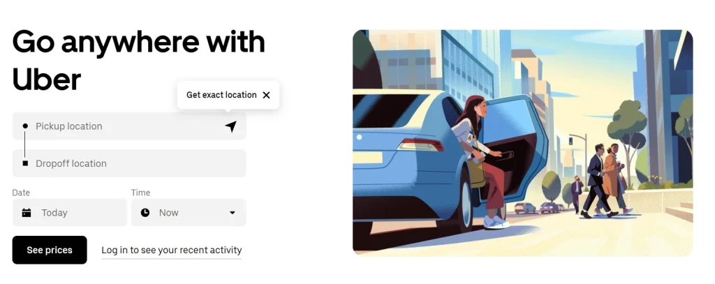
Understanding the needs and interests of the target audience, creating an eye-catching design and content, and continuously making improvements are essential for an effective Landing Page. This ensures that visitors turn into potential customers and plays a vital role in the success of a business’s digital marketing strategy.
A Landing Page is a web page designed to serve a specific purpose. Typically, it is created to encourage visitors to take a specific action. This action could be purchasing a product, starting a subscription, or filling out a form.
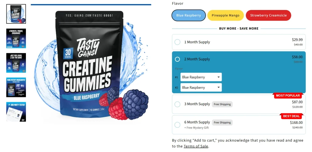
The primary goal of Landing Pages is to convert visitors into potential customers. This conversion is achieved when the visitor completes a specific action. For example, you might ask them to click on a discount offer and then fill out a form to purchase the product.
Many Landing Pages include a form to collect visitors’ contact information. This form is used to allow visitors to accept offers or request more information. Businesses build their potential customer databases this way and engage with them.
Landing Pages are specially designed web pages aimed at guiding visitors to take a specific action while also aiming to acquire potential customers. These pages typically offer a clear value proposition and provide benefits to visitors.
The reason for creating a dedicated page where people need to fill out a form is to eliminate distractions and fully capture visitors’ attention. By removing menus, links, and alternative clickable elements, you can focus the visitor’s attention. This approach offers an opportunity to direct visitors toward a potential customer form.
According to a survey, the average conversion rate for Landing Pages across all industries was found to be 5.89%. If the conversion rate exceeds 10%, it is considered a highly successful result. While 43.6% of survey participants stated that their primary goal was lead generation, 33.7% indicated that their top priority was direct customer acquisition. Now, let’s move on to how to implement the best Landing Page practices to ensure your pages are optimized for conversions.
The detailed steps to create a Landing Page are as follows:
Over the years, we’ve noticed that at least seven out of ten people will leave a Landing Page immediately upon visiting. Our goal is to reduce this number by explaining the benefits visitors will gain within seconds of landing on the page.
The headline is the first thing they will read, and it must clearly convey the value of the Landing Page and the offer.
I always include visuals on Landing Pages. The purpose of an image is to evoke an emotion and show visitors how they will feel.

Certain visuals may perform better than others, so it’s essential to test your options.
Your lead form should be easily accessible for potential customers who want to convert quickly.
This could be a link, a form, or a redirect to a form. As the user scrolls down the page, ensure your layout moves with them.
Think of your Landing Page as a crucial step in the journey of your potential customer reaching your product or service offers. The offer is what you provide in exchange for their personal information.
Your offer should not only be attractive enough for visitors to share their contact details but also relevant to your business.

While you may want to collect as much information as possible about your potential customer, the amount of information you request depends on various factors: how well they know you, where they are in the buyer’s journey, and their level of trust in you.
By only asking for essential information in your lead form, you can create a low barrier to entry. For a new lead, just a name and email may suffice.
Your Landing Page has one purpose: to convert visitors into potential customers. Competing links, including internal links to other pages on your website, will distract from this goal. By removing other links from your page, you can focus visitors’ attention on your call-to-action message.

Your Landing Pages, like all other pages on your website, must be responsive to all viewing experiences. Your form not displaying on mobile devices is the last thing you need. Give your visitors every opportunity to convert, no matter how they view your page. Tools like HubSpot’s Marketing Hub Starter, with its drag-and-drop Landing Page editor, make it incredibly easy to create mobile-optimized Landing Pages and forms.
While you will drive visitors to your Landing Page through email, social media shares, and other marketing strategies, your page should also be optimized for paid campaigns and organic search (SEO). If someone searches for your target keyword, they should find it on your Landing Page. Similarly, when targeting a keyword with paid ads, ensure it is present on your Landing Page.
A thank-you page is where you direct potential customers after they fill out a form. While it’s possible to display a thank-you message on the same page or omit it entirely, there are several reasons why this isn’t the best option. A thank-you page serves three primary purposes:
Design is typically associated with creativity, colors, and aesthetic visuals. We design Landing Pages to be more functional, goal-oriented, and user-friendly. Therefore, to create an effective Landing Page, you must use both logic and creativity.
Design is often linked to creativity, colors, and aesthetic visuals. We take design a step further to make Landing Pages more functional, goal-oriented, and practical. Therefore, creating an effective Landing Page requires both analytical thinking and creativity.
However, as we understand, you will still need compelling colors and attractive visuals—don’t misinterpret this. Below, we’ll discuss how to bring all these elements together.
The good news is that you don’t need to be overly original here. I’ve noticed that most Landing Pages follow a similar structure because it has been proven to work. You can showcase your creativity through branded elements and visuals, but it’s better to stick to the traditional Landing Page format.
Trust me, most people don’t read every word of your cleverly crafted text. Instead, they skim through and pick out the most important parts. Your goal is to highlight this information to ensure your visitor doesn’t miss any critical details.
This could mean a few things…
Your Landing Page design should reflect your website’s design, including the colors you use. If you want to build a long-term connection with Landing Page visitors, it’s important they recognize your brand colors and unique style.
As people become more familiar with your brand, they will trust you more (and the more they trust you, the easier it will be to get them to take the desired action). Consider using contrasting colors for elements that need to stand out, such as the CTA button.
For example, if your brand colors are green, you might use purple to grab users’ attention.
Take Advantage of Automation with Artificial Intelligence!
How can you use your time more efficiently? Artificial intelligence saves you time by automating repetitive tasks. Learn how you can leverage AI to accelerate your business processes.

Visuals are one of the first elements people notice on a Landing Page, and they process images much faster than text, significantly influencing their overall experience.
But how do you choose from millions of stock photos or company photoshoots that take up all the space on your computer?
Narrow down your selection by asking a few key questions:
Is Your Ad Budget Flowing but Nothing in Return?
Get Free Ad Analysis with Digipeak!
Which campaigns are a waste of money? Are you spending unnecessary money? Where are the potential opportunities? We examine your ad performance in detail. Fill out the form now for a free analysis!
The answers to these questions play a crucial role in determining the image you highlight and center on your Landing Page.
If you want to effectively reach your target audience, it’s important to represent them accurately.
Get an Offer


Join Us So You Don't
Miss Out on Digital Marketing News!
Join the Digipeak Newsletter.
Related Posts

In an industry where trends change faster than seasons, relying on old-school advertising is a …
The digital commerce landscape is currently navigating through its most profound structural transformation since the …
If you're here, you're likely feeling the pressure of the "e-commerce squeeze." Advertising costs on …

The digital marketing playbook has been completely updated. In 2026, the old method of "spray …