
Pinterest Advertising: A Complete Guide by Digipeak
At Digipeak, we've helped countless businesses transform their digital presence through Pinterest advertising. Through our …
02/03/2023 -
5 dk okuma
Stay up to date with Peakers
Web design composition patterns are constantly changing and evolving. At the same time, there are some mainstream styles that won’t go away, such as the “pervasive moderation” and “vivid level depictions” we’ve been seeing for a while now.
While you want to make your website design attractive, the web compatibility of your site pages is also very important. Before moving on to our design suggestions, ‘What should be considered in website design?’ We recommend that you take a look at our article.
Let’s take a look at them together. In a nutshell:
Dark mode, which was an important model for 2020 with OLED screens, started to become even more popular among users a year later. You should definitely add dark mode to your website, which will provide convenience for visitors with sensitive eyes.
Today, simple designs are widely preferred because they look nice and elegant. Telegram, Instagram, Twitter, Facebook, and Apple are just some of the big brands that offer optional features in their organizations. If you’re interested in more design examples, check out the iPhone Market collection.
Hand-drawn design elements are great at “adding emotion and humanity to websites,” something that tech-weary users crave.
In fact, this rebellious trend is almost the opposite of pixel perfection. So showcase jagged edges and exposed shapes to show how human and realistic your brand is.
Volumetric graphics have always fascinated people, but they are not widely used because of their cost. Until virtual reality becomes more mainstream and affordable, hyper-realistic 3D images that take up the entire screen are the best way to create an immersive experience on your site.
With the advances in web technology, web designers are increasingly using 3D elements as games are constantly being improved, VR/AR technologies are gaining momentum, and 3D elements are being given beauty and impact.
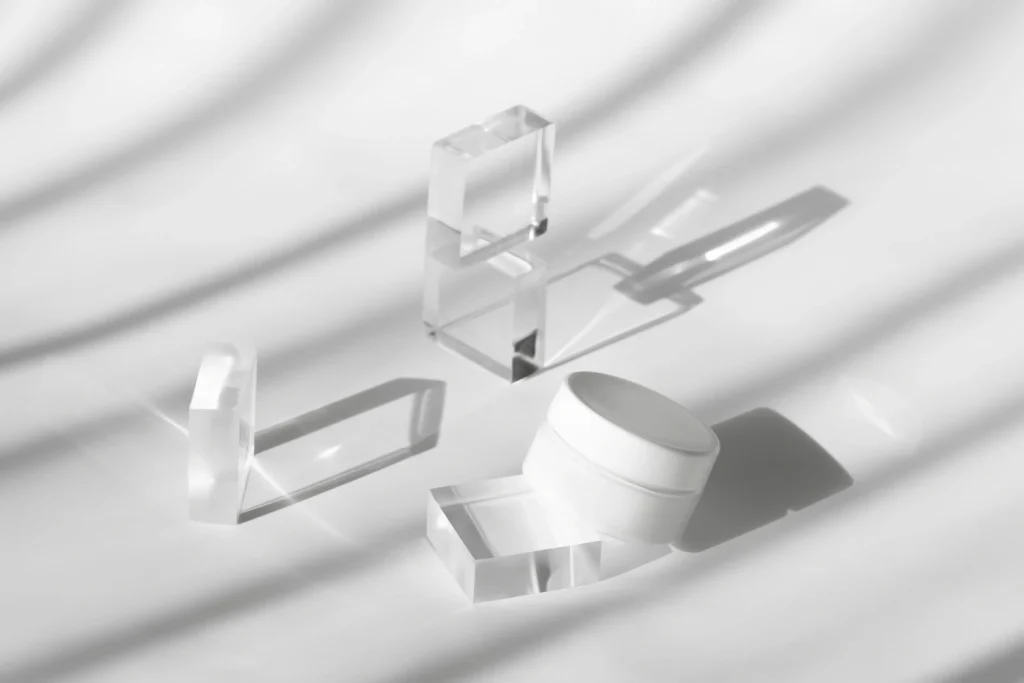
Components with delicate shadows and color gradation create a pseudo-3D effect and make images more layered and captivating.
This type of patterning is intended to add depth to the images. In addition to images, text and photographs are used to support this goal. This gives the whole work a sense of elegance, as if the components are overlapping. You can add layers and color gradients like these to your website if you want to give your website visitors a good visual experience.
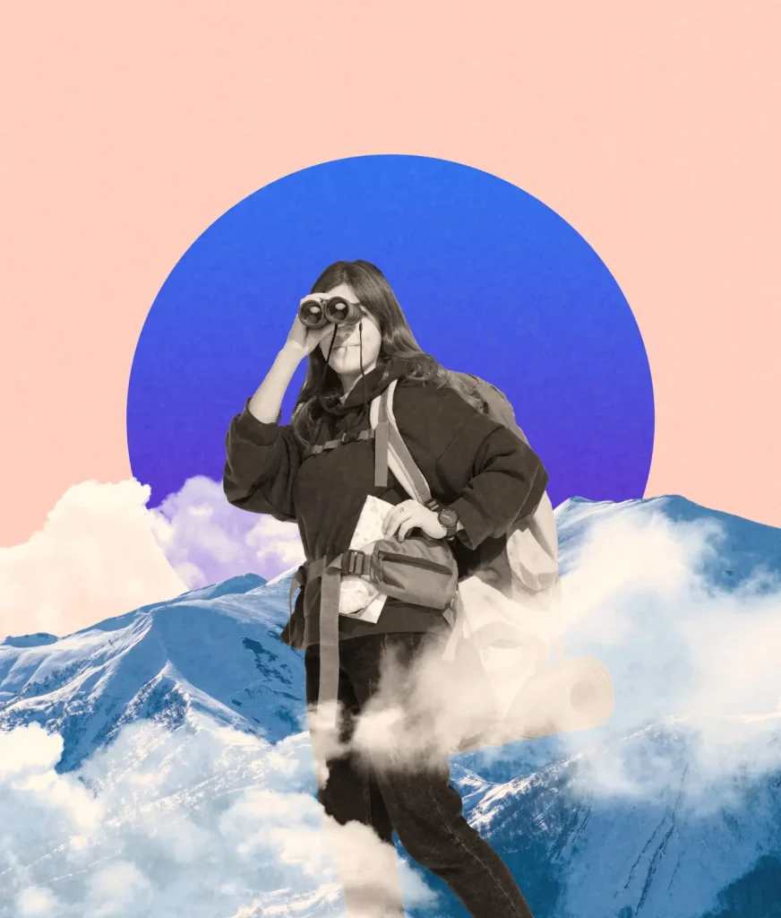
By mixing real photos with illustrations or graphics, users can get a sense of what the brand is about. The style of these images can influence how people interpret them. For example, cartoon swirls can be used for something more playful; geometric swirls can be used for something more complex. High-quality photos look great on their own. But adding graphics in addition to photos can really show off your creative side.
Layouts with full product versions have been trending in web design for a long time.
Designers are now moving away from rigid structures and experimenting with different ways of using white space to give more structure to their designs.
You can review our color psychology article in the design we have prepared for designers.
To give the design a feel, they use clean framing methods. Stability and solidity; order and regularity.
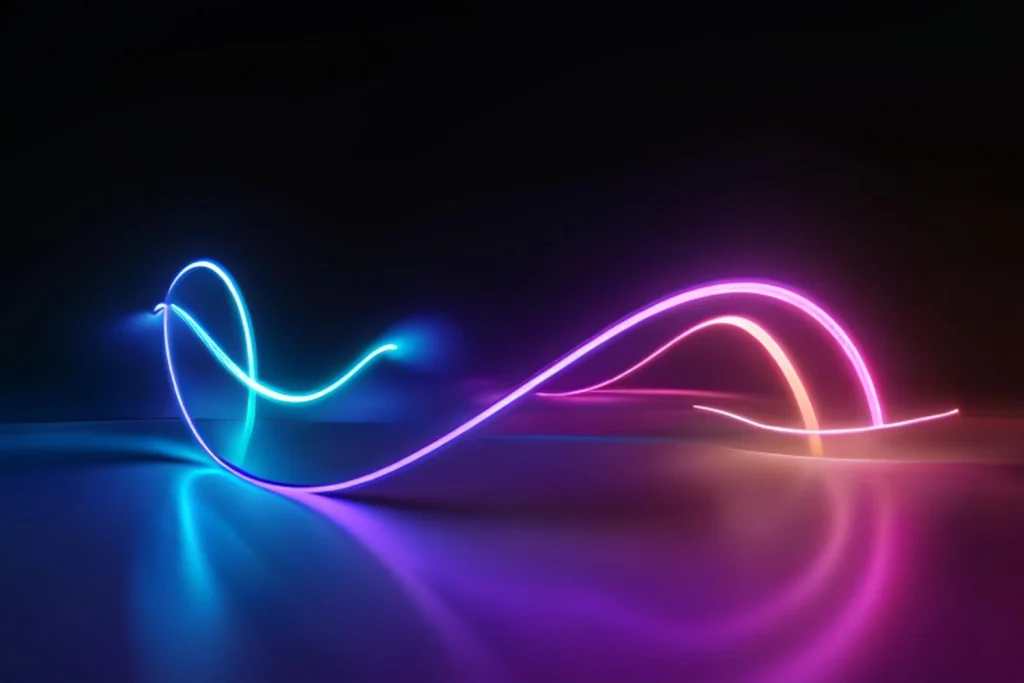
Futuristic colors like blue, purple, and bright pink give a sense of brightness to those who see the design. Professionals use bold color combinations to make a web design look realistic as if it will literally jump off the screen. This trend is especially evident in two-color web design. It fits perfectly with other emerging trends such as extreme minimalism and dark mode.
Web designers have started to move towards more video with voice scripts and less interactive text in the website content. In the last few years, navigation has become easier to adapt to very small devices, and user attention span has decreased even further. Designs with extremely minimalist navigation remove many of the challenges for the user.
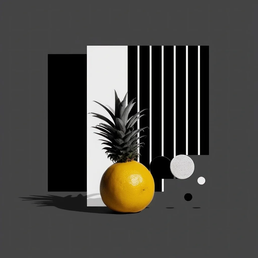
Recent improvements in web technology have made it easier to make websites look like they are made of frosted glass. The blurred appearance of elements behind the overlay makes text or objects legible. When you add text directly on top of an image, it will not be possible to read the text. You can create a frosted glass effect (Glassmorphism) with simple CSS tricks.
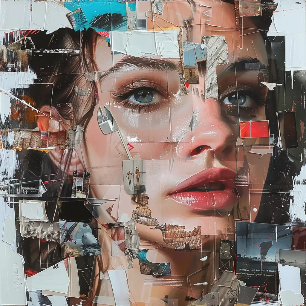
The idea is to dazzle customers and grab their attention by making interesting and unrealistic elements look real. These images allow potential consumers to use their imagination and stay on your website longer. This way, you can increase the average session duration and improve your conversion rate.
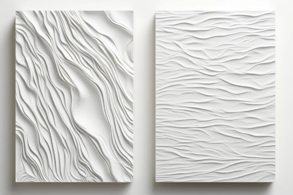
After years of ethereal gradients and smooth isometric objects, textures are back. By creating outlines and veins, you can make users reach out and touch the textures. However, try not to overuse them, because you might direct visitors’ attention to the packaging instead of your brand.
In conclusion, a company’s online success depends on how much it spends on a website’s design. With the ten design tips in this article, you can create a website that grabs attention and leaves a long-lasting impression on visitors. Each of our suggestions is crucial for improving the user experience and increasing engagement.
Consult a qualified digital marketing agency like Digipeak to take your website design to the next level. As we have a lot of experience with web design and development, we can help you develop a website that is both good-looking and useful. Contact Digipeak to find out how our services can help your brand increase its online visibility.
Get an Offer


Join Us So You Don't
Miss Out on Digital Marketing News!
Join the Digipeak Newsletter.
Related Posts

At Digipeak, we've helped countless businesses transform their digital presence through Pinterest advertising. Through our …

Although the term "graphic design" has only been in use since the 1920s, this art …

Font is a very important design element for SaaS (Software as a Service) businesses. It …

The payment page is a section within a website or web page where users can …