
Why Every Medical Practice Needs a Professional Website
a medical practice without a website is almost invisible. Patients increasingly start their health journey …
09/04/2024 -
9 dk okuma
Stay up to date with Peakers
The payment page is a section within a website or web page where users can enter their payment information to complete purchase or order transactions. It typically includes fields where users can input payment details such as credit card information, billing addresses, and various types of identity verification. Additionally, the payment page displays a summary of the total cost of the purchase transaction, applicable taxes or fees, and an overview of the purchased products/services.
Payment pages are a crucial component of e-commerce websites, certain reservation systems, subscription services, and various other online platforms involving financial transactions. The design and functionality of the payment page can significantly influence user trust, conversion rates, and overall user experience. Therefore, the user interface of the payment page should be optimized to make it safe and easy for users to complete transactions.
The payment page is of paramount importance in e-commerce websites, being the final stage where transactions are completed. Its design and functionality directly influence user trust, satisfaction, and ultimately conversion rates. This critical page represents the bridge where users entrust sensitive payment information, serving as the link between browsing and purchasing. Therefore, optimizing the user interface (UI) and user experience (UX) of the payment page is crucial. A well-designed payment page should provide users with clarity, security, and ease of use, guiding them seamlessly through the payment process.
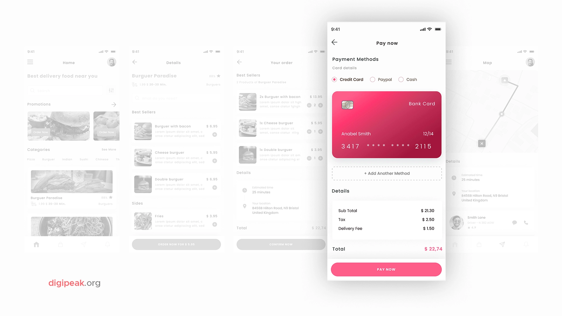
Designing a payment page focused on providing an excellent user experience (UX) and user interface (UI) is of great importance to ensure seamless transactions and customer satisfaction. A user-friendly design facilitates users’ understanding of the payment process and enhances their trust. Therefore, each stage of the payment page should be thoughtfully crafted to gain users’ trust and encourage them to complete transactions.
We’ve compiled eight rules for you to follow to optimize the UI/UX design of a payment page:
By following these tips, you can create a payment page that not only facilitates seamless transactions but also enhances the overall user experience, leading to higher conversion rates and customer satisfaction.
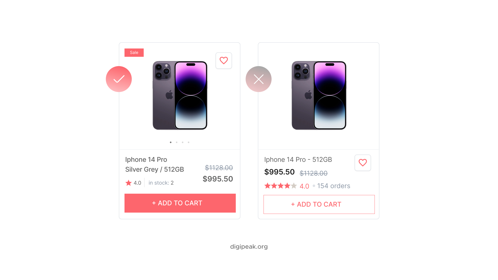
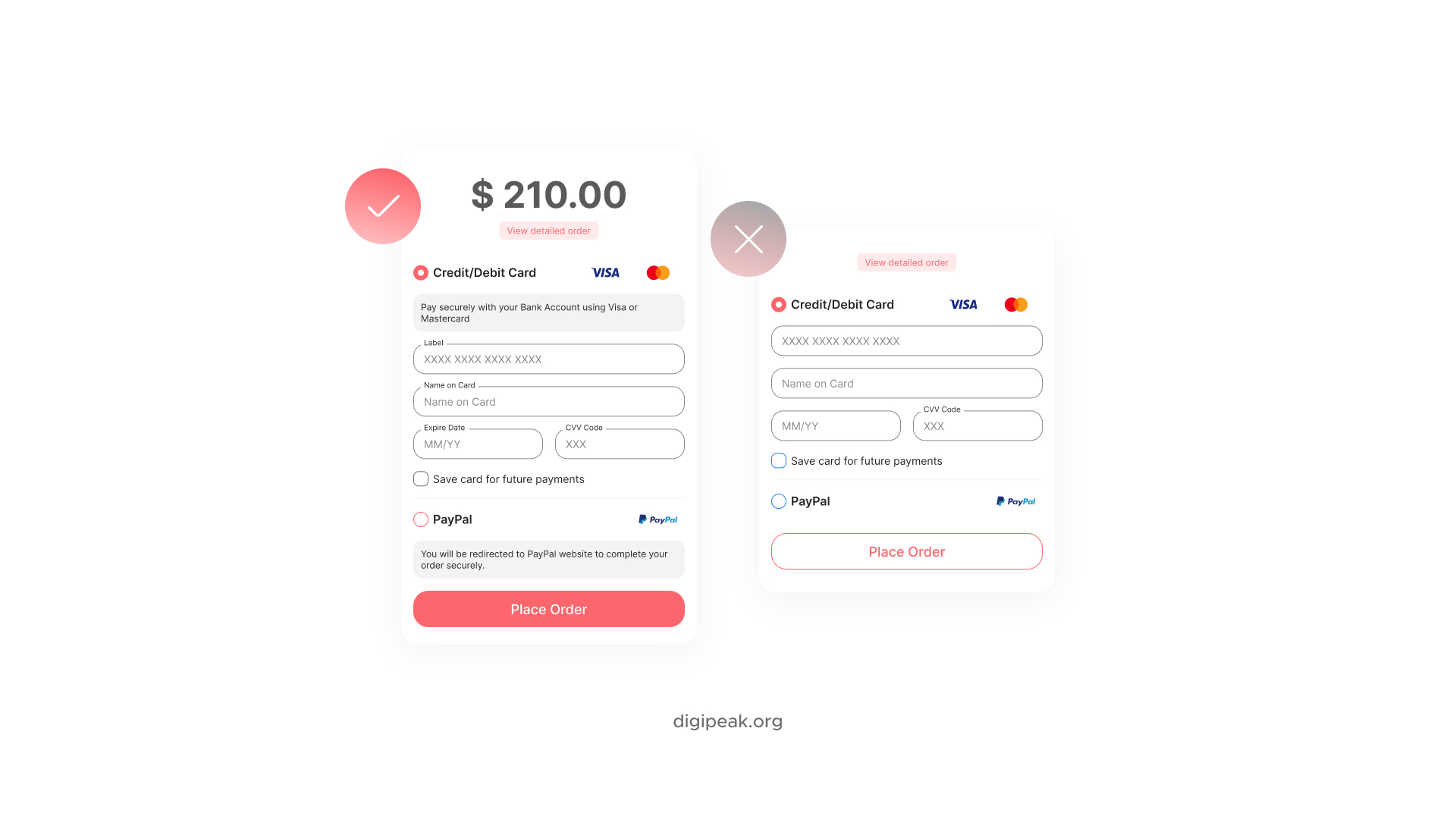
When it comes to designing payment pages, some common mistakes can significantly impact the user experience and hinder conversion rates. Focusing on a simple, clear, and secure design on the payment page is crucial to prevent these errors and provide a better user experience. This way, user satisfaction can be increased, and conversion rates can be improved.
We’ve assessed the fundamental design mistakes allowed in the design of key user interface elements on the payment page:
As the Digipeak creative team, we undertook the entire digital renewal process of an e-commerce website in recent months. We completely redesigned the existing website to be more user-focused and sales-driven. You can review this comprehensive project, which we completed after approximately three months of meticulous work, through the “Clos – Clothing Supplier” link.

By choosing our agency for the interface design of your e-commerce site, you can have a website that opens the door to high conversion rates. Our professional team utilizes the latest technologies and creative approaches to deliver unique and impactful designs.
Get in touch with us for user-friendly interfaces, stunning graphics, and excellent user experience, and let us help you elevate your brand in the online space. With our agency’s expertise and passion, we can take your e-commerce project to the next level. Contact us now for more details!
Checkout design is a critical element of an e-commerce site that influences customers to complete the purchase process. A user-friendly, reliable, and simple checkout page design encourages customers to complete the purchase and reduces abandonment.
Take Advantage of Automation with Artificial Intelligence!
How can you use your time more efficiently? Artificial intelligence saves you time by automating repetitive tasks. Learn how you can leverage AI to accelerate your business processes.
Important elements of a checkout page design include a security badge, easy navigation, visual simplicity, clear and concise payment options, concise form fields, customer information fields, and trustworthiness markers.
Your Visuals Stand Out But You're Not Getting Any Feedback?
Get a Free Design Audit Now!
Let's evaluate together how you can better engage with your target audience visually, dysfunctional designs, and tips to increase engagement. Fill out the form now and get your free analysis report!
The main considerations in checkout page design for mobile devices include a simple and user-friendly interface, easily clickable buttons, adequate size of form fields, and fast loading times.
Security and user experience are especially important in payment page design in terms of SEO. The use of SSL certificates, mobile compatibility, fast loading times, and correct HTML structures are necessary to achieve better rankings in search engines.
To increase conversion rates, the checkout page design can provide a simple and clear step-by-step process, include credibility symbols and customer testimonials, offer secure payment options, and optimize form fields.
Colors are important in checkout design to reflect brand identity, as well as to attract users’ attention and build trust. White backgrounds, pastel shades, and prominent color accents are generally preferred.
Simplifying the checkout process, avoiding hidden costs, providing clear and understandable communication, adding credibility symbols, and offering alternative payment options can be effective strategies to reduce user abandonment.
User feedback on checkout design is important to understand users’ experiences and identify potential improvements. Feedback should be analyzed regularly, efforts should be made to solve users’ problems, and positive feedback should be highlighted.
Get an Offer


Join Us So You Don't
Miss Out on Digital Marketing News!
Join the Digipeak Newsletter.
Related Posts

a medical practice without a website is almost invisible. Patients increasingly start their health journey …

Mobile app UX (User Experience) design focuses on creating intuitive, user-centered interfaces and interactions for …

At Digipeak, we've helped countless businesses transform their digital presence through Pinterest advertising. Through our …

Although the term "graphic design" has only been in use since the 1920s, this art …