
What is Graphic Design? How to Create Graphic Design?
Although the term "graphic design" has only been in use since the 1920s, this art …

11/01/2024 -
7 dk okuma
Stay up to date with Peakers
One of the most important elements of interface design is typography. Using the right typography can significantly improve the user experience. Users consume content more easily and can interact more. Type styles affect the readability, aesthetics and user experience of texts.
In an interface, texts often enable users to get information, give instructions or facilitate interaction by conveying the brand’s message. Therefore, the choice of fonts is of great importance to ensure that users can easily read and understand the text, present an aesthetic appearance and enhance the user experience.
Let’s take a closer look at the importance of using fonts in interface design and the effects of different fonts!
The following should be considered when using different writing styles in interface design;
The different fonts chosen should be appropriate for the purpose of the design, the target audience, and the brand identity. Font selection is very important for the success of an interface design. Choosing a font that will reflect the brand’s personality, emphasize its values, and meet the expectations of the target audience will increase the impact of the design and improve the user experience. For example, there will be a difference between a design for children and a news site. While a more rounded font will be chosen for children, a more serious font will be chosen for the news site.
A minimum number of fonts should be chosen to make the design look organized. Choosing a maximum of two families will help you maintain consistency. One can be used for headings and the other for other text. If there is a large font family, a single font can also be used. This will make our design look better. Using too many different typefaces will complicate the design and create an inconsistent look.

The font chosen should not only align with the brand identity but also with the content. Each font has a specific character and style and should match the tone, purpose, and message of the content. For example, there will be a big difference between the font used for a formal corporate document and the font used for a promotional page for a creative and fun product. Also, if more than one font is used, there should be harmony and consistency between them.
Transitions and combinations between fonts should be carefully considered and chosen to create a harmonious look. Characteristics such as the style, weight, height, and width of fonts should be compatible with each other. This consistency helps the design make a professional and balanced impression. As an interface designer, some methods can be used to achieve harmony between fonts.
For example, consistency can be achieved by using different variations of the same font family (bold, italic, light, etc.). In addition, the orientation, spacing, and alignment of font typefaces should also be compatible. These are important factors in creating a cohesive and consistent interface design where different fonts work together and provide a holistic design experience.
Since there are different areas such as title, text, and buttons in the interface design, the text has to be used in very different sizes. The design can also be viewed on small screens and should be designed accordingly. For this reason, the font chosen should be readable at any size. Whether it is a large headline or a small sub-text, users should be able to easily read and understand the text at any size. The font should remain clear and distinct even when the size is reduced.
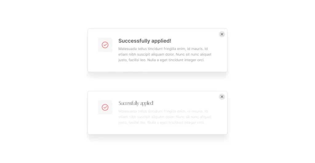
The main purpose of the font is to make the text easy to read. A font that users can read comfortably should be chosen. Letters should be clear and distinct in font writing styles. Sans-serif fonts are generally preferred to increase readability. This type of font provides clarity and readability because it has simple and straight lines.
Serif fonts, on the other hand, can have a more traditional look and, in some cases, affect readability. However, both font types can provide an effective reading experience when used correctly. Choosing aesthetic fonts that users can read comfortably, with clear and distinct lettering, enhances the user experience and ensures that text content communicates effectively.
Contrast is also a factor that affects readability. Sufficient contrast between the font style and the text background makes the text more distinct. It helps users distinguish text more easily with their eyes.
Make sure that the design works properly in different languages. Considering that each language has its own unique characters, letters, and grammar, the design should be created to cover these differences. For example, it is important that an interface designed in English be properly displayed and understood when translated into Turkish or any other language.
Therefore, the font chosen should support Turkish characters. It is important that letters used in Turkish such as “ğ”, “ş”, “ü”, “ı”, “ö”, “ç” are represented correctly in font styles. Choosing the right font, its suitability for language features, and the expandability of text areas ensure that the design is effective and user-friendly for users of different languages.
To summarize;
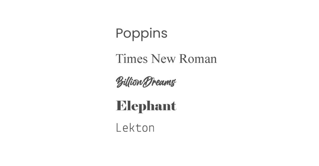
Some of the most preferred fonts in interface design are as follows:
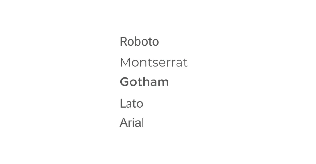
These are just a few of the popular interface design fonts. It is important to choose a font that suits your design purpose and target audience. Preferred fonts can vary from project to project and designer to designer, so it’s important to explore different font options and choose the one that best suits your needs.
The importance of using fonts in interface design is something you need to consider to successfully shape your digital experience. Choosing the right fonts that reflect brand personality, ensure readability and usability, and help create an emotional connection will help users make a strong connection with your site or app and leave a lasting impression.
Digipeak is a growth marketing focused digital marketing agency that puts user experience at the top. Interface design is one of Digipeak’s key priorities, and we place great emphasis on font selection to create user-friendly, visually appealing interfaces. The unique interface design services offered by our creative team enable users to engage with your brand and enhance their digital experience.
You can benefit from Digipeak’s services to take your interface design to the next level, win the hearts of users, and make your brand unique. Digipeak will help you transform your digital presence with custom-designed interfaces, impressive font usage, and user-friendly experiences. Contact us now and discover the power of fonts in interface design to ensure your users have an unforgettable experience!
Get an Offer


Join Us So You Don't
Miss Out on Digital Marketing News!
Join the Digipeak Newsletter.
Related Posts
Although the term "graphic design" has only been in use since the 1920s, this art …

Font is a very important design element for SaaS (Software as a Service) businesses. It …

The payment page is a section within a website or web page where users can …

Brutalism in graphic design is a design style that draws inspiration from architectural Brutalism, a …


